
Responsive Design – Why Your Personal Training Website Needs To Be Mobile Friendly
yeswebsite
14 Feb, 2024

Most personal training clients use their mobile devices to search for information, book appointments, and connect with instructors. If your personal training website is not optimized for mobile, you could be missing out on potential clients. In this guide, we will discuss the importance of responsive design and why it is necessary for the success of your personal training business.
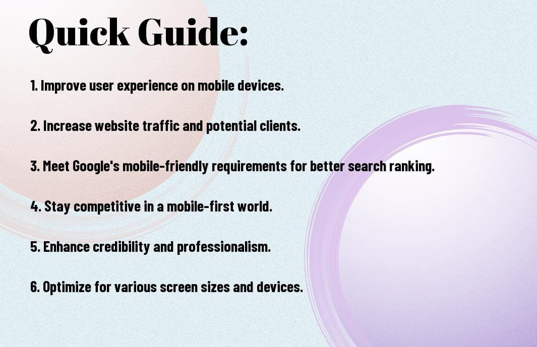
Key Takeaways:
- Increased User Experience: A mobile-friendly website ensures that your personal training services are easily accessible and provide a seamless experience for potential clients on any device.
- Improved SEO Ranking: Google prioritizes mobile-friendly websites in search results, boosting your website’s visibility and attracting more organic traffic to your personal training business.
- Higher Conversion Rates: By optimizing your website for mobile users, you can increase the chances of converting website visitors into actual clients, ultimately growing your personal training business.
Exploring Responsive Design
What is Responsive Design?
Little do many know that responsive design is the approach of creating a website that adapts to the user’s device and screen size. In simple terms, a responsive design ensures that your website looks great and functions well on desktops, laptops, tablets, and smartphones. This adaptation is achieved through using flexible layouts and grids, images and CSS media queries.
To create a responsive design, designers and developers use a mix of flexible grids and layouts, images, and CSS media queries. This allows the website to automatically switch to accommodate for resolution, image size, and scripting abilities as the user’s device changes. By implementing responsive design, you are ensuring that your personal training website provides an optimal viewing experience for all visitors, regardless of the device they use.
Key Types of Responsive Layouts
Responsive design typically involves three key types of layouts: flexible, adaptive, and responsive. Each layout type has its own strengths and weaknesses, but the goal remains the same – to provide an optimal viewing experience across a wide range of devices.
Thou must understand the differences between these layouts to determine which one best suits your personal training website. Here is a breakdown of the key types of responsive layouts:
| Layout Type | Description |
| Flexible Layout | Uses relative units for sizing elements, allowing them to adapt based on the user’s screen resolution. |
| Adaptive Layout | Designs multiple fixed layout sizes based on common device widths, serving the appropriate layout based on the device being used. |
| Responsive Layout | Combines the flexibility of flexible layouts with predefined breakpoints to adjust the design based on the device’s screen size. |
- Each layout type offers its own advantages and challenges, so it is crucial to select the one that best aligns with your website’s goals and audience.
- Importantly, the information should be broken down into a table for a clearer understanding of the key types of responsive layouts.
The Benefits of a Mobile-Friendly Website
Advantages for Personal Trainers
For personal trainers, having a mobile-friendly website can significantly enhance their online presence and attract more clients. A website that is optimized for mobile devices allows potential clients to easily access information about the trainer’s services, schedule, and testimonials from anywhere at any time. This convenience can lead to increased inquiries and bookings as clients appreciate the easy access to information on-the-go.
Moreover, a mobile-friendly website can improve the overall user experience, making it easier for clients to navigate the site, view training packages, and contact the trainer. With more people using their smartphones and tablets to search for services online, having a mobile-optimized website is necessary for personal trainers to stay competitive in the digital age.
Pros and Cons of Responsive Design
For personal trainers looking to create a mobile-friendly website, understanding the pros and cons of responsive design is crucial. Here is a breakdown of the advantages and disadvantages:
| Pros | Cons |
| Improved user experience | Potential longer load times |
| Consistent branding across devices | Complexity in design and development |
| Cost-effective solution for multi-device compatibility | Potential issues with older browsers |
| Boosts SEO rankings | Requires ongoing maintenance for optimal performance |
More Information on Pros and Cons of Responsive Design
Any personal trainer considering the implementation of responsive design on their website should carefully weigh the pros and cons to make an informed decision. While responsive design can offer numerous benefits, it is necessary to address potential challenges such as longer load times and ongoing maintenance requirements. By understanding both sides of responsive design, personal trainers can make the right choice to improve their online presence and attract more clients.

Factors to Consider for Mobile Optimization
Once again, in today’s digital age, having a mobile-friendly website is important for any personal training business looking to attract and retain clients. When optimizing your site for mobile devices, there are several key factors to consider to ensure a seamless user experience and improved search engine visibility.
- Ensure your website is mobile-friendly and responsive to adapt to various screen sizes.
- Optimize images and videos for faster loading times on mobile devices.
- Implement clear and concise navigation for easy access to important information.
- Focus on fast loading times to minimize bounce rates and improve user experience.
The Mobile-Friendly and Responsive Design for SEO guide can provide additional insights on best practices and trends in mobile optimization.
Speed and Performance Considerations
Considerations for speed and performance are crucial when optimizing your personal training website for mobile devices. Slow loading times can deter visitors and impact your search engine rankings. Ensure that your site loads quickly by optimizing images, minifying code, and leveraging browser caching. Regularly test your site’s speed and performance to identify and address any issues promptly.
Investing in a reliable web hosting service and utilizing content delivery networks (CDNs) can significantly improve your site’s speed and performance on mobile devices. By prioritizing speed optimization, you can enhance the overall user experience and increase engagement on your website.
User Experience on Different Devices
One of the critical factors to consider for mobile optimization is ensuring a consistent user experience across various devices, including smartphones, tablets, and desktops. Design your website with a responsive layout that adapts seamlessly to different screen sizes and resolutions. Test your site on multiple devices to ensure that all elements display correctly and functionality remains intact.
Factors such as font size, button placement, and content organization play a crucial role in creating a user-friendly experience on different devices. By focusing on responsiveness and usability, you can enhance user engagement and encourage visitors to explore your personal training services further.
Step-by-Step Guide to Making Your Site Mobile Friendly
Many personal training websites today are missing out on a huge opportunity by not being mobile-friendly. With more users accessing the internet through their mobile devices, it’s crucial to ensure that your website is responsive and easy to navigate on smartphones and tablets. In this guide, we will walk you through the process of making your site mobile-friendly.
| Initial Planning and Design | Technical Aspects of Building a Responsive Site |
| For a successful mobile-friendly website, it all starts with proper planning and design. Consider the layout, content, and functionalities that are vital for mobile users. Keep it simple and prioritize the most important information for easy access on smaller screens. | Responsive design is the key to ensuring your website looks great on any device. This involves using CSS media queries to adapt the layout and content based on the screen size. Make sure your images are optimized for mobile and that navigation is user-friendly. |
Initial Planning and Design
For a mobile-friendly personal training website, you need to think about how users will interact with your site on their mobile devices. Consider the user experience and ensure that vital information such as services, contact details, and testimonials are easily accessible. Keep the design clean and uncluttered to enhance readability.
It’s also important to prioritize speed and performance. Mobile users expect fast loading times, so optimize your website by compressing images, minifying CSS and JavaScript files, and utilizing browser caching. Test your site on various devices to ensure a seamless experience across different screen sizes.
Technical Aspects of Building a Responsive Site
Responsive design goes beyond just adjusting the layout for mobile devices. It also involves ensuring that your site is optimized for different screen sizes, resolutions, and orientations. This means using fluid grids and flexible images to create a responsive and adaptive design that looks great on any device.
Tips for Enhancing Mobile User Experience
Despite the growing use of mobile devices, many personal training websites are still not optimized for mobile users. To ensure that your website caters to this important demographic, it’s crucial to enhance the mobile user experience. Here are some tips to help you achieve this:
- Streamline your content for easy readability on smaller screens.
- Utilize interactive and touch-friendly elements to engage users.
- Optimize your website for fast loading times on mobile devices.
- Ensure that your website is easy to navigate with intuitive design features.
Streamlining Content for Mobile Users
Any personal training website aiming to enhance the mobile user experience should focus on streamlining content for easier consumption on smaller screens. This includes keeping text concise, using shorter paragraphs, and prioritizing important information. By minimizing clutter and optimizing content layout, you can ensure that mobile users can quickly find the information they need.
It’s also necessary to use responsive design techniques that adjust the layout of your website based on the screen size of the device. By adopting a mobile-first approach to content organization, you can create a seamless experience for users accessing your website on smartphones and tablets.
Interactive and Touch-Friendly Elements
Tips for enhancing the mobile user experience also include incorporating interactive and touch-friendly elements on your personal training website. By adding features such as collapsible menus, swipeable image galleries, and clickable buttons, you can make the user experience more engaging and intuitive. These elements not only improve user interaction but also enhance the overall aesthetic appeal of your website.
To further enhance user engagement, consider integrating features like touch gestures and animations to provide a rich and interactive experience for mobile users. By incorporating these elements thoughtfully, you can create a dynamic and user-friendly website that stands out in the competitive online landscape.

Testing and Maintenance of Your Mobile-Friendly Site
Tools and Methods for Testing Responsiveness
Testing the responsiveness of your site is crucial to ensure that it functions well on all devices. There are various tools available such as Google’s Mobile-Friendly Test, which allows you to check how easily a visitor can use your page on a mobile device. Another popular tool is BrowserStack, which enables you to test your website across multiple devices and browsers to ensure consistency.
Additionally, you can use developer tools in browsers like Google Chrome to simulate how your site appears on different screen sizes. These tools help you identify any issues and make necessary adjustments to improve the user experience on mobile devices.
Ongoing Maintenance and Updates
The ongoing maintenance of your mobile-friendly site is crucial to ensure optimal performance. Regularly update your content and images to keep your site fresh and engaging for visitors. It’s also important to check for any broken links, loading issues, or outdated information that may affect the user experience.
Regularly monitoring your site’s performance metrics and user feedback can help you identify areas that need improvement and make necessary updates to enhance responsiveness and usability. By staying proactive with maintenance and updates, you can ensure that your personal training website remains relevant and user-friendly on all devices.
To wrap up
Presently, it is crucial for personal training websites to prioritize mobile-friendly design due to the increasing number of users accessing the internet on their smartphones and tablets. By implementing responsive design techniques, personal trainers can ensure that their websites are accessible and user-friendly across all devices, providing a seamless browsing experience for potential clients.
Having a mobile-friendly website not only improves user experience but also positively impacts search engine rankings, ultimately driving more traffic to the site. Therefore, investing in responsive design is important for personal trainers looking to enhance their online presence and attract a wider audience in today’s digital age.
FAQ
Q: What is responsive design?
A: Responsive design is an approach to web design that makes web pages render well on a variety of devices and window or screen sizes.
Q: Why is responsive design important for personal training websites?
A: Responsive design is important for personal training websites because it ensures that your site is accessible and usable on mobile devices, which are increasingly used by people to access the internet.
Q: How does responsive design benefit my personal training website?
A: Responsive design benefits your personal training website by providing a consistent user experience across different devices, improving mobile search rankings, and increasing mobile traffic and conversions.
Q: What are the key features of a mobile-friendly personal training website?
A: Key features of a mobile-friendly personal training website include a responsive layout, easy navigation, fast loading times, mobile-friendly forms, and clear calls to action.
Q: How can I make my personal training website mobile-friendly?
A: To make your personal training website mobile-friendly, you can use a responsive design framework, optimize images and videos for mobile, prioritize content hierarchy, and test your site on different devices and screen sizes.
Continue reading
Purely you


Leave a Reply