
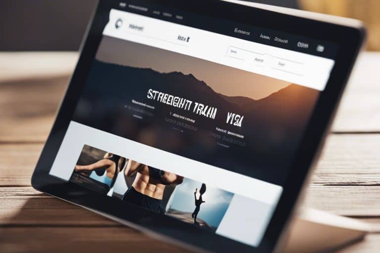
Don’t underestimate the importance of intuitive website navigation when it comes to creating a user-friendly experience for your visitors. As a personal trainer looking to attract and retain clients through your website, ensuring that your navigation is clear and user-friendly is important. In this guide, we will outline the dos and don’ts of website navigation to help you optimize your site for maximum effectiveness.
Key Takeaways:
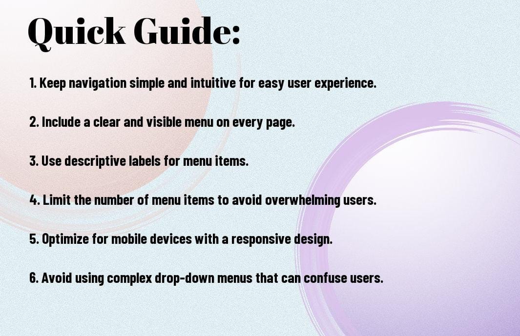
- Clear navigation: Ensure your website has a simple and intuitive navigation menu for easy access to important information.
- Consistent labeling: Use clear and consistent terms for menu items to avoid confusion among visitors.
- Avoid clutter: Keep your navigation menu uncluttered by limiting the number of items and using submenus when necessary.
Types of Website Navigation
If you want to create a seamless user experience on your personal trainer website, the type of navigation you choose is crucial. The way visitors navigate your site can impact their overall impression and how easily they can find the information they seek. Here are some popular types of website navigation:
| Horizontal Navigation | Vertical Navigation |
| Drop-Down Menus | Mega Menus |
| Sticky Navigation Bars | Mobile Navigation |
Horizontal vs. Vertical Navigation Layouts
Vertical navigation layouts are ideal for websites with a lot of pages or sections as they allow for easy scanning and access to different areas. Users can visually see all the options at once and navigate to their desired destination quickly.
Horizontal navigation layouts are more traditional and work well for websites with fewer pages or sections. They are typically placed at the top of the website and are easily accessible, making it simple for users to find what they are looking for.
Drop-Down Menus and Mega Menus
Types of navigation menus like drop-down and mega menus are excellent for organizing a large amount of content into manageable sections. Drop-down menus display subcategories when users hover over a menu item, providing a streamlined navigation experience.
A mega menu is an expanded version of a drop-down menu that typically displays multiple columns of links and images, offering even more options and content at a glance.
For more complex websites with extensive content, mega menus can be a great way to provide users with a comprehensive overview of your offerings.
Sticky vs. Static Navigation Bars
For websites with long-scrolling pages or extensive content, a sticky navigation bar can be incredibly useful. A sticky navigation bar remains visible at the top of the screen as users scroll down, ensuring that important navigation links are always accessible.
Static navigation bars, on the other hand, stay in a fixed position on the page and do not move as users scroll. While static navigation bars are more traditional, they may not be as user-friendly for websites with a lot of content that requires frequent scrolling.
Plus, a sticky navigation bar can enhance user experience by providing easy navigation options without the need to scroll back to the top of the page.
Mobile Navigation: Hamburger Menus and Beyond
Website navigation on mobile devices is important, as more users access websites from smartphones and tablets. Hamburger menus, consisting of three horizontal lines that expand into a menu when clicked, are commonly used on mobile sites to save screen space.
Sticky navigation bars are particularly beneficial for mobile websites, as they ensure that important navigation links are always visible and easily accessible, regardless of the user’s location on the page.
Tips for User-Friendly Navigation
Now, when it comes to creating a user-friendly website navigation for personal trainers, there are some key dos and don’ts to keep in mind. By following these guidelines, you can ensure that your visitors have a seamless and enjoyable experience while browsing your site.
Clarity and Simplicity: Less Is More
An vital tip for user-friendly navigation is to prioritize clarity and simplicity in your design. Keep your navigation menu straightforward and easy to understand. Use descriptive labels that clearly indicate what each menu item represents. Avoid cluttering your navigation with unnecessary items that may confuse visitors. Keep in mind, less is often more when it comes to website navigation.
Another crucial aspect of clarity and simplicity is to maintain a consistent layout across all pages of your website. This includes keeping the placement of your navigation menu consistent so that visitors always know where to find it. Thou should also ensure that the navigation structure remains the same throughout the site for a seamless browsing experience.
Consistency Across Pages
One of the key principles of user-friendly navigation is consistency across all pages. When visitors navigate through your website, they should encounter familiar elements and patterns that guide them intuitively. This consistency helps build trust and familiarity with your site, making it easier for visitors to find what they are looking for.
More so, consistency extends beyond just the navigation menu. It also includes the design elements, color scheme, and overall user interface. By maintaining a cohesive look and feel throughout your website, you can create a more unified and user-friendly experience for your visitors.
Using Descriptive Labels for Menu Items
An effective way to enhance user-friendly navigation is by using descriptive labels for your menu items. Instead of generic terms like ‘Services’ or ‘About Us’, opt for more specific labels that clearly communicate the content of each page. This will help visitors quickly understand what to expect when they click on a menu item, improving the overall usability of your site.
Simplicity is key when it comes to creating descriptive labels. Avoid jargon or technical terms that may confuse visitors. Instead, use language that is clear, concise, and easy to understand. By providing descriptive labels for your menu items, you can streamline the navigation process and make it easier for visitors to find the information they need.
Prioritizing Accessibility in Navigation
Pages should be designed with accessibility in mind, ensuring that visitors of all abilities can easily navigate your site. This includes using clear and easy-to-read fonts, providing alternative text for images, and making sure that all interactive elements are keyboard accessible. By prioritizing accessibility in your navigation, you can create a more inclusive experience for all visitors.
Menu should also be structured logically, with a clear hierarchy that guides visitors through the different sections of your site. This helps users understand the relationship between pages and find the information they need efficiently. By focusing on accessibility in your navigation design, you can make your website more user-friendly and welcoming to a diverse audience.
Step-by-Step Guide to Designing Your Navigation Structure
Your The Top 10 Fitness Website Design Mistakes That Are…
Identifying the Key Pages and Categories
The first step in designing your navigation structure is to identify the key pages and categories that will make up your website. These are the foundational elements that will guide users through your site and help them find the information they need. By organizing your content into logical groupings, you can ensure that visitors can easily navigate your site and access the information they are looking for.
Organizing Pages Into Logical Groups
Identifying how to organize your pages into logical groups is crucial for a well-structured navigation system. By grouping related content together, you can create a cohesive user experience that guides visitors seamlessly through your site. This not only helps users find what they are looking for more efficiently but also improves the overall usability of your website.
Pages should be organized in a hierarchical manner, with main categories at the top level and subcategories underneath. This helps users understand the relationship between different sections of your website and makes it easier for them to navigate through the content.
Implementing Calls-to-Action in Navigation
Designing effective calls-to-action within your navigation is vital for driving user engagement and conversions. Calls-to-action prompt visitors to take specific actions, such as signing up for a newsletter, booking a consultation, or purchasing a product. By strategically placing these calls-to-action within your navigation, you can guide users towards these desired actions and improve the overall effectiveness of your website.
Navigation menus should not only serve as a roadmap for users but also as a tool for encouraging them to take action. By incorporating clear and compelling calls-to-action in your navigation, you can effectively drive user behavior and achieve your website’s goals.
Testing and Refining the Navigation Layout
Layout testing is an vital step in the website design process to ensure that your navigation structure is intuitive and user-friendly. Testing involves gathering feedback from real users to identify any pain points or confusion in the navigation layout. By analyzing user behavior and making data-driven decisions, you can refine your navigation structure to improve user experience and overall site performance.
Groups of test users can help uncover any navigation issues and provide valuable insights into how to improve the layout. By conducting regular testing and refining your navigation based on user feedback, you can create a seamless and intuitive experience for visitors to your website.
Factors to Consider When Developing Navigation
Not all website navigation is created equal. When developing the navigation for your personal training website, there are several key factors to consider to ensure a user-friendly experience for your visitors. Perceiving your navigation from the user’s perspective is crucial to creating an intuitive and efficient navigation system.
Understanding Your Target Audience
An important starting point when designing website navigation is understanding your target audience. Consider the demographics, preferences, and behavior of your audience. This insight will help you tailor the navigation to meet their expectations and make it easier for them to find the information they are looking for.
By understanding your target audience, you can anticipate their needs and preferences when it comes to navigating your website. This will enable you to create a seamless user experience that caters to their specific requirements and ultimately leads to higher engagement and conversion rates.
The Role of Visual Hierarchy in Navigation Design
An effective navigation system relies on visual hierarchy to guide users through the website. Visual hierarchy involves arranging and prioritizing elements on a page based on their importance. By establishing a clear hierarchy, you can direct users’ attention to the most critical elements and help them navigate the site more efficiently.
Visual hierarchy in navigation design also influences user behavior by determining the order in which information is presented. By strategically organizing the navigation elements, such as menus, buttons, and links, you can create a logical flow that enhances the user experience and encourages exploration of the website.
Visual hierarchy plays a crucial role in ensuring that users can easily scan and locate relevant information on a webpage. By using visual cues such as size, color, contrast, and spacing, you can draw attention to key elements and create a visually pleasing layout that improves usability and engagement.
The Impact of SEO on Navigation Choices
The importance of search engine optimization (SEO) in website navigation cannot be overstated. SEO plays a significant role in determining how easily your website can be found on search engines. By incorporating SEO best practices into your navigation design, you can improve visibility and drive organic traffic to your site.
This involves optimizing navigation elements such as anchor text, internal linking structure, and sitemap organization to enhance search engine crawlability and indexability. By aligning your navigation with SEO strategies, you can improve your website’s ranking and attract more qualified leads to your personal training business.
This alignment between navigation design and SEO practices is crucial for boosting your online presence and reaching a broader audience. By implementing SEO-friendly navigation choices, you can increase your visibility in search results and establish your website as a credible and authoritative source in the fitness industry.
Balancing Aesthetics with Functionality
With website navigation, it is important to strike a balance between aesthetics and functionality. While it is important to create a visually appealing navigation menu that aligns with your branding, it should not compromise usability. The navigation should be intuitive, easy to understand, and provide clear pathways for users to navigate the site.
By maintaining this balance, you can create a visually engaging website that also offers a seamless user experience. Aesthetic elements such as color schemes, typography, and imagery should complement the functionality of the navigation, enhancing the overall look and feel of the site while ensuring ease of use for visitors.
Targeting the right balance between aesthetics and functionality in website navigation is important for creating a positive user experience. By combining visually appealing design elements with intuitive navigation practices, you can captivate your audience and encourage them to explore your personal training services further.

Pros and Cons of Common Navigation Strategies
Once again, when it comes to designing a website for personal trainers, the navigation plays a crucial role in the user experience. Here are some common navigation strategies along with their pros and cons:
| Navigation Strategy | Pros and Cons |
| Single-Level Menus | Provide immediate access to all main sections of the website but may become cluttered with too many links. |
| Multi-Level Menus | Organize content into categories for easier navigation but may require more clicks to reach specific pages. |
| Text Links | Are straightforward and clear for users but can take up more space on the screen. |
| Iconography | Can make the navigation visually appealing but may not always be as intuitive for all users. |
| Search Bars | Allow users to quickly find specific information but require an additional step to use. |
| Social Media Links | Help in increasing social media presence but can distract users from the main website content. |
Single-Level vs. Multi-Level Menus
Cons: When considering whether to use single-level or multi-level menus, personal trainers should weigh the trade-off between immediate access to information and the organization of content. Single-level menus can offer quick navigation, but they may lead to a cluttered interface. On the other hand, multi-level menus provide a structured hierarchy for content but may require users to click through multiple layers to find what they are looking for.
Text Links vs. Iconography
The decision between text links and iconography hinges on the balance between clarity and aesthetics. Text links are explicit and easily understood by users, although they can occupy more space on the screen. Conversely, icons can enhance the visual appeal of navigation but may not always convey their meaning universally. Personal trainers should consider their target audience’s preferences and technological proficiency when making this choice.
The effectiveness of navigation strategies greatly influences the user experience and engagement on a personal trainer’s website. Whether opting for text links or iconography, each choice impacts how visitors interact with the site and find relevant information. Therefore, personal trainers must strategically select the navigation elements that best align with their brand identity and the needs of their audience.
The Use of Search Bars in Navigation
Strategies surrounding search bars in website navigation involve offering users a convenient method to search for specific content. While search bars can accelerate the process of finding information, they add an extra step for users who need to actively input their queries. Personal trainers should evaluate the complexity of their website’s content and the user’s search behavior to determine if integrating a search bar aligns with the overall user experience.
One consideration for personal trainers is to integrate predictive text or auto-complete features within the search bar to assist users in formulating their queries efficiently. By leveraging these functionalities, trainers can enhance the user experience by providing instant suggestions as users type, ultimately improving the overall navigation experience on the website.
Integrating Social Media Links into Navigation
SingleLevel Integrating social media links into the website navigation allows personal trainers to seamlessly connect their online platforms and extend their reach to a broader audience. However, the placement of social media links within the navigation menu should be carefully considered to avoid overshadowing important website content. Trainers should strike a balance between promoting their social presence and maintaining a seamless user journey on their website.

Advanced Navigation Features for Personal Trainers
For personal trainers looking to elevate their website navigation, there are advanced features that can enhance user experience and drive engagement. To dive deeper into effective website navigation, refer to the 10 Dos and Don’ts of Effective Website Navigation Design. Here are some key advanced navigation features to consider:
- Interactive Elements for Enhanced Engagement
- Integrating Booking Systems and Schedules
- Personalization Tactics for Returning Users
- Utilizing Analytics for Navigation Optimization
Interactive Elements for Enhanced Engagement
For personal trainers, interactive elements such as workout planners, progress trackers, and live chat support can enhance user engagement on your website. By incorporating interactive features, you can provide a more dynamic and personalized experience for your visitors, ultimately encouraging them to stay longer on your site and increase their interaction with your services.
Interactive elements also help in building a sense of community among your clients, fostering relationships and loyalty. Consider including features like fitness challenges, Q&A forums, and social sharing buttons to create a more interactive and engaging environment for your users.
Integrating Booking Systems and Schedules
Enhanced scheduling and booking systems can streamline the process for clients to book sessions with you, reducing friction and improving overall user experience. By integrating online booking tools, calendars, and automated reminders, you can make it convenient for clients to schedule appointments, classes, or consultations directly through your website.
This seamless integration not only saves time for both you and your clients but also minimizes the chances of double bookings or missed appointments. Additionally, having a visible and easy-to-navigate schedule on your website can enhance transparency and help clients plan their fitness routines more effectively.
Personalization Tactics for Returning Users
Personalizing the user experience for returning visitors can significantly impact engagement and retention on your website. By leveraging user data and behavior patterns, you can tailor content, recommendations, and offers to each individual’s preferences and needs. Personalization tactics such as targeted emails, customized workout plans, and special promotions can make returning users feel valued and keep them coming back for more.
Interactive
Utilizing Analytics for Navigation Optimization
Any personal trainer serious about improving their website navigation should leverage analytics tools to track user behavior, identify pain points, and optimize the navigation flow. By analyzing metrics such as bounce rates, click-through rates, and popular pages, you can gain valuable insights into how users interact with your site and make data-driven decisions to enhance the overall navigation experience.
Integrating
Summing up
As a reminder, website navigation is a crucial aspect of setting up a successful online presence for personal trainers. By following the dos and don’ts outlined in this guide, trainers can ensure that their websites are user-friendly, easy to navigate, and optimized for a positive user experience. Remember to keep things simple, intuitive, and organized to help visitors find the information they need quickly and efficiently.
By avoiding common pitfalls such as cluttered menus, broken links, or excessive pop-ups, personal trainers can create a seamless browsing experience that encourages potential clients to explore their services further. Implementing clear calls-to-action, a responsive design, and regular maintenance will help trainers stay competitive in the online space and attract more clients to achieve their business goals.
FAQ
Q: Why is website navigation important for personal trainers?
A: Website navigation is crucial for personal trainers because it allows visitors to easily find information, services, and contact details on your website. Clear navigation enhances user experience, improves engagement, and boosts conversion rates.
Q: What are the dos of website navigation for personal trainers?
A: The dos of website navigation for personal trainers include:
- Use clear and concise menu labels for easy understanding.
- Include a search bar for quick access to specific information.
- Organize content logically and hierarchically.
- Ensure mobile responsiveness for on-the-go users.
- Perform usability testing to identify and fix navigation issues.
Q: What are the don’ts of website navigation for personal trainers?
A: The don’ts of website navigation for personal trainers are:
- Avoid using jargon or complex terminology in menu items.
- Avoid cluttering the navigation bar with too many options.
- Avoid using confusing navigation structures that may confuse visitors.
- Avoid broken links or outdated information in the navigation menu.
- Avoid using pop-ups or auto-play videos that disrupt user experience.
Q: How can personal trainers optimize their website navigation for better user experience?
A: Personal trainers can optimize their website navigation for better user experience by:
- Using intuitive navigation labels that are easily understood by visitors.
- Implementing a clean and user-friendly design with consistent navigation elements.
- Creating a logical flow of information to guide users to their desired content.
- Including calls-to-action in the navigation to encourage user interaction.
- Regularly updating and refining navigation based on user feedback and analytics.
Q: How can personal trainers track the effectiveness of their website navigation?
A: Personal trainers can track the effectiveness of their website navigation by:
- Monitoring user behavior through analytics tools to see how visitors navigate the site.
- Conducting A/B testing on different navigation structures to see which performs better.
- Soliciting feedback from users through surveys or usability testing.
- Tracking metrics such as bounce rate, time on page, and conversion rates related to navigation.
- Continuously optimizing navigation based on data and user insights for ongoing improvements.
Continue reading
Purely you


Leave a Reply