
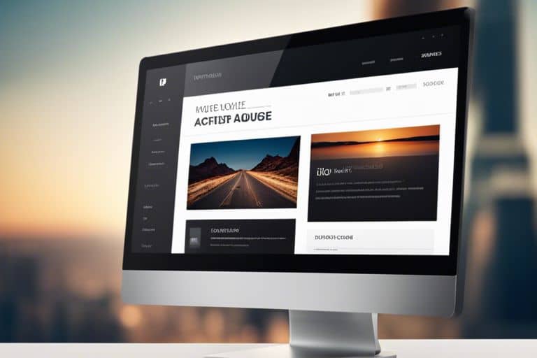
User Experience (UX) is crucial when it comes to the success of your website. It encompasses the overall feel of your site, including how easy it is for users to navigate and find what they are looking for. Enhancing the navigation and design of your website can greatly improve the user experience, leading to increased engagement, conversions, and overall satisfaction. In this guide, we will explore some key strategies to enhance navigation and design on your website to ensure a seamless and enjoyable experience for your visitors.
Key Takeaways:
- Clear Navigation: Ensure your website has easily accessible menus and links for users to navigate through different pages effortlessly.
- Consistent Design: Maintain a consistent design theme throughout your website to provide a cohesive user experience.
- User-Centric Approach: Put yourself in the user’s shoes and design your website in a way that prioritizes user needs and preferences.
Understanding User Experience (UX)
One Why is User Experience Important in Web Design? of the key factors in creating a successful website is understanding the concept of User Experience (UX). User Experience refers to the overall experience a person has when interacting with a website or application. It encompasses a variety of elements, including usability, accessibility, design, and performance, all of which contribute to how a user perceives a website.
Definition of User Experience
Understanding the definition of User Experience is important for designing a website that meets the needs and expectations of its users. User Experience can be described as the combination of a user’s emotions, attitudes, and behaviors when using a website. It focuses on how users feel about the interactions they have with a website, emphasizing the importance of creating a positive and enjoyable experience for visitors.
Types of User Experiences in Web Design
With User Experiences in web design can be categorized into various types that cater to different user needs and preferences. These include:
- Efficient experience
- Engaging experience
- Intuitive experience
- Accessible experience
- Useful experience
Plus, the way a user experiences a website can significantly impact their perception of a brand or business. By understanding the different types of User Experiences and designing with them in mind, you can create a website that effectively engages and retains visitors, ultimately leading to increased conversions and brand loyalty.
| Efficient Experience | Focuses on helping users accomplish tasks quickly and easily |
| Engaging Experience | Keeps users interested and involved through interactive and visually appealing elements |
| Intuitive Experience | Makes it easy for users to navigate and understand the website’s layout and features |
| Accessible Experience | Ensures that all users, including those with disabilities, can access and use the website |
| Useful Experience | Provides valuable content and functionality that meets the needs of users |
Key Factors Influencing UX
All successful websites have one thing in common: a great user experience (UX). User experience encompasses a range of factors that contribute to how a visitor interacts with your site. Understanding and optimizing these factors is crucial for retaining visitors and converting them into customers. Here are some key factors that influence UX:
Perceiving and implementing the following elements can significantly enhance the user experience on your website.
Accessibility: Making Your Website Usable for All
Making your website accessible is not just a good practice; it’s a legal requirement in many countries. Accessibility ensures that people with disabilities can navigate and interact with your site effectively. By following accessibility guidelines, you can reach a wider audience and provide a better user experience for all visitors.
Responsiveness: Ensuring Seamless Interaction Across Devices
Website responsiveness is vital in today’s digital landscape where users access websites on various devices. A responsive design adapts your site’s layout to different screen sizes, ensuring a seamless experience across desktops, laptops, tablets, and smartphones. This flexibility is key to engaging users and keeping them on your site longer.
Ensuring your website is mobile-friendly is no longer an option but a necessity. Mobile users make up a significant portion of internet traffic, and search engines prioritize mobile-friendly sites in their rankings. By investing in responsive design, you can provide a consistent user experience and improve your site’s visibility in search results.
Loading Times: Affecting User Satisfaction and Retention
User attention spans are getting shorter, and a slow-loading website can have a massive impact on user satisfaction and retention. Users expect websites to load quickly, and if they have to wait too long, they are likely to abandon the site. Optimizing your site’s loading times by compressing images, minifying code, and investing in a reliable hosting provider can improve user satisfaction and encourage visitors to stay longer on your site.
Retention rates can be directly impacted by how quickly your website loads. Users are more likely to return to a site that loads quickly and efficiently. By prioritizing loading times, you can increase user retention and ultimately drive more conversions on your website.
Visual Hierarchy: Guiding Users Intuitively Through Content
Guiding users through your website content in a clear and intuitive way is vital for a positive user experience. Visual hierarchy involves arranging elements on a page in a way that directs the user’s attention and guides them through the content flow. By using color, size, contrast, and spacing effectively, you can create a hierarchy that helps users navigate your site easily and find the information they need quickly.
Plus, a well-defined visual hierarchy can enhance the overall aesthetics of your website, making it more visually appealing and engaging for visitors. By structuring your content in a logical and organized manner, you can improve usability and keep users on your site longer.
Design Essentials for Improved Navigation
Now let’s research into the design importants that can significantly enhance the navigation experience on your website. These elements play a crucial role in guiding users seamlessly through your site, making it easier for them to find what they are looking for.
Layout Types and Their Impact on Navigation
In terms of website navigation, the layout plays a key role in ensuring a smooth user experience. The way information is structured and displayed can greatly influence how easily users can navigate through your site. Here are some common layout types and their impact on navigation:
- Fixed Layout
- Fluid Layout
- Grid Layout
- Parallax Scrolling
- Single Page Layout
The layout you choose should align with your content and overall website goals to ensure optimal navigation. The right layout can enhance user engagement and encourage visitors to explore more of your site. The key is to maintain a balance between creativity and functionality to provide a user-friendly navigation experience.
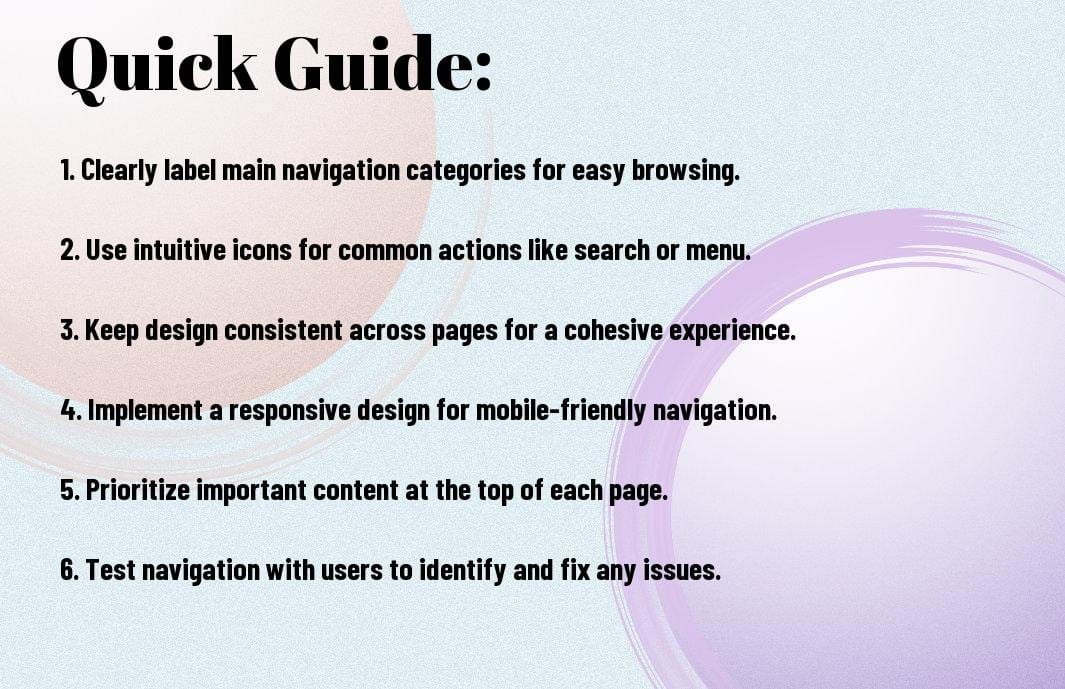
Menu Design Tips for Enhanced User Flow
An intuitive menu design is important for ensuring a seamless user flow on your website. A well-structured menu can help users quickly locate the information they are seeking, enhancing their overall browsing experience. Here are some menu design tips to improve user flow:
- Keep it simple and concise
- Use descriptive labels
- Organize menu items logically
- Include visual cues such as icons
- Ensure easy access to important pages
The menu design should reflect the hierarchy of your content and guide users to the most relevant sections of your website. By implementing these tips, you can streamline the navigation process and make it easier for visitors to interact with your site.
When designing your menu, consider the placement, visibility, and responsiveness of the menu elements. A well-designed menu ensures that users can navigate through your site effortlessly, leading to a more satisfying browsing experience. The menu serves as the roadmap for users, guiding them to their desired destinations with ease.
The Role of Icons and Buttons in Directing Users
Enhanced user navigation can be achieved through the strategic use of icons and buttons on your website. These visual elements can grab users’ attention and direct them to important sections of your site. Icons and buttons serve as visual cues that help users understand the purpose of different elements on a webpage.
It is important to use icons and buttons consistently throughout your site to maintain a cohesive user experience. By incorporating these visual aids strategically, you can guide users through your website and prompt them to take desired actions. Icons and buttons not only enhance navigation but also contribute to the overall aesthetics of your site.
Using Breadcrumbs for Contextual Awareness
Types of navigation aids like breadcrumbs can provide users with contextual awareness of their location within your website. Breadcrumbs are a navigational tool that displays the user’s path from the homepage to the current page. This feature helps users understand the relationship between different sections of your site and navigate back easily if needed.
Role of Breadcrumbs in enhancing user navigation cannot be understated. They offer users a sense of orientation within your site and improve the overall user experience. By including breadcrumbs in your website design, you can help users navigate more efficiently and reduce the chances of getting lost in the vastness of your site.

Step-by-Step: Streamlining Your Website’s Navigation
Once again, we examine into the intricacies of user experience design, focusing this time on enhancing navigation and design on your website. Streamlining your website’s navigation is crucial for providing a seamless user experience that keeps visitors engaged and encourages them to explore further.
| Evaluating Existing Navigation Structures | Planning for an Intuitive User Pathway |
|---|---|
| An effective way to start streamlining your website’s navigation is by evaluating your existing structures. Take a detailed look at your current menus, links, and navigational elements to identify any pain points or areas of improvement. | An intuitive user pathway is important for guiding visitors through your website efficiently. By planning and organizing your content in a logical flow, you can help users find what they are looking for quickly and easily. |
Evaluating Existing Navigation Structures
An effective way to start streamlining your website’s navigation is by evaluating your existing structures. Take a detailed look at your current menus, links, and navigational elements to identify any pain points or areas of improvement. Consider conducting usability tests or gathering feedback from users to pinpoint any roadblocks they may encounter while navigating through your site.
Planning for an Intuitive User Pathway
An intuitive user pathway is important for guiding visitors through your website efficiently. By planning and organizing your content in a logical flow, you can help users find what they are looking for quickly and easily. This involves mapping out the user journey from entry points to conversion goals, ensuring that each step along the way is clear and intuitive.
Step-by-Step: When planning for an intuitive user pathway, consider the user’s perspective at each stage of their journey. Anticipate their needs and behaviors to design a navigation structure that aligns with their expectations and makes information easily accessible.
Implementing Changes and Iterative Testing
To enhance your website’s navigation, implement the changes identified during the evaluation phase. This may involve restructuring menus, simplifying navigation paths, or optimizing search functionality. Once the changes are in place, conduct iterative testing to gather feedback and measure the effectiveness of the improvements.
Testing: Iterative testing allows you to monitor how users interact with the new navigation features and identify any areas that may still need refinement. Use A/B testing, heatmaps, or session recordings to track user behavior and make data-driven decisions for further enhancements.
Integrating Feedback to Refine Navigation
An important aspect of optimizing your website’s navigation is integrating feedback from users. By listening to their suggestions, complaints, and observations, you can gain valuable insights into how to refine the navigation further. Implement user feedback tools and encourage visitors to provide input on their experience to continuously improve the usability of your site.
Navigation: Remember that user experience is a journey, not a destination. By continuously evaluating, planning, implementing changes, and integrating feedback, you can refine your website’s navigation to provide a seamless and intuitive experience for your visitors.
Enhancing Your Website’s Aesthetics
Unlike other aspects of web design, aesthetics play a critical role in capturing the attention of visitors and creating a memorable user experience. Enhancing the visual appeal of your website goes beyond just making it look pretty; it involves strategically incorporating design elements to evoke emotions and convey your brand’s identity.
Fundamental Principles of Visual Design
Design is not just about making things look visually pleasing; it’s about creating a harmonious balance of elements to guide the user’s eye and communicate your message effectively. The fundamental principles of visual design, such as alignment, contrast, proximity, and repetition, form the basis of a strong visual hierarchy that directs the user’s focus and enhances readability.
Tips for Selecting Fonts, Colors, and Imagery
On your website, fonts, colors, and imagery play a crucial role in evoking the right emotions and reinforcing your brand identity. When choosing fonts, opt for easy-to-read typefaces that align with your brand’s personality and ensure consistency across different devices. Choose a color palette that not only complements your brand but also enhances user experience by guiding users through the site’s information hierarchy.
- Use high-quality images that are relevant to your content and resonate with your target audience. The imagery you choose should reinforce your brand message and evoke the desired emotional response from visitors.
Websites that effectively integrate fonts, colors, and imagery create a visually appealing experience that resonates with users on a subconscious level. By paying attention to these details, you can establish a strong visual identity that sets your website apart and leaves a lasting impression on visitors.
Creating a Cohesive Brand Experience
Creating a cohesive brand experience involves aligning all visual elements on your website with your brand’s identity and values. From the logo and color scheme to the imagery and tone of voice, every aspect of your website should reflect your brand’s personality and create a consistent experience for visitors.
Any deviation from your brand’s established guidelines can lead to confusion and dilute the impact of your messaging. By ensuring a cohesive brand experience across all touchpoints, you can build trust with your audience and foster brand loyalty.
Balancing Aesthetics and Functionality
Experience shows that a website must strike a delicate balance between aesthetics and functionality to provide an optimal user experience. While visual appeal is crucial in capturing users’ attention, functionality ensures that visitors can easily navigate and interact with your site. Balancing these two aspects requires thoughtful consideration of design choices and user preferences to create a website that is both visually appealing and highly functional.
Balancing aesthetics and functionality is an ongoing process that involves gathering user feedback, analyzing website performance metrics, and making informed design decisions. By continuously evaluating and refining the visual and functional aspects of your website, you can create an engaging user experience that keeps visitors coming back for more.
Pros and Cons of Different Design Decisions
To create a user-friendly website, it’s crucial to consider the pros and cons of various design decisions. Here is a breakdown of the advantages and disadvantages of some common choices:
| Design Decision | Pros and Cons |
| Fixed Navigation | Provides consistent access to key pages but takes up screen space. |
| Dynamic Navigation | Maximizes screen space but may be less intuitive for users. |
| Minimalism in Design | Offers a clean and modern look but can lack visual interest. |
| Complexity in Design | Allows for creativity and detailed storytelling but may overwhelm visitors. |
| Trend-Following in UX | Keeps the design current and appealing but risks becoming outdated quickly. |
Fixed vs. Dynamic Navigation Systems
Decisions regarding fixed or dynamic navigation systems can significantly impact how users interact with your website. Fixed navigation provides a consistent menu that is always visible, which can help users quickly access important pages. However, it can take up valuable screen space that could be used for content. On the other hand, dynamic navigation systems hide the menu until the user interacts with it, maximizing screen real estate for content. This approach can create a clean and minimalist design but may be less intuitive for some users.
Minimalism vs. Complexity in Design Elements
Any design choice should strike a balance between minimalism and complexity to create a visually appealing website that also effectively communicates information. Minimalist design offers simplicity and elegance, making it easier for users to focus on necessary content. However, an overly minimalistic approach can lack visual interest and make the website feel sterile. On the contrary, complexity in design elements can add depth and texture, engaging users with a rich visual experience. Yet, too much complexity can overwhelm visitors and distract them from the main message.
A well-thought-out design should aim to find the sweet spot between minimalism and complexity, ensuring a visually appealing and user-friendly website. By carefully selecting design elements and striking the right balance, you can create a site that not only looks great but also enhances the user experience.
The Benefits and Drawbacks of Trend-Following in UX
Dynamic changes in design trends can influence user experience by affecting how users perceive and interact with a website. Adapting to current design trends can make your website appear modern and appealing to users familiar with the latest styles. However, trend-following can also make your site blend in with the competition and quickly become outdated as new trends emerge. It’s necessary to carefully consider which design trends to incorporate into your website to ensure a balance between a contemporary look and timeless appeal.
Navigation plays a crucial role in user experience, and staying informed about current trends can help you make strategic decisions that enhance usability and engagement on your website. By understanding the benefits and drawbacks of trend-following in UX, you can create a design that resonates with your audience while maintaining a strong and unique visual identity.

Advanced Tips for Refined UX
Many website owners strive to enhance their user experience to stay ahead in the competitive online landscape. By implementing advanced tips for a refined user experience, you can set your website apart and attract and retain more visitors.
- Personalization and User-Centric Approaches
- Incorporating Multimedia Content Strategically
- Leveraging Data and Analytics for Continuous Improvement
Personalization and User-Centric Approaches
Approaches such as personalization and user-centric design can significantly impact how users engage with your website. Personalization involves tailoring the website content and experience based on user preferences and behavior. By understanding your target audience and their needs, you can create a more customized and relevant experience for each visitor.
User-centric approaches focus on putting the user at the center of the design process. By incorporating features that prioritize user satisfaction and usability, such as intuitive navigation and clear calls to action, you can ensure a seamless and enjoyable experience for your visitors.
Incorporating Multimedia Content Strategically
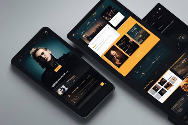
On top of engaging written content, incorporating multimedia elements like videos, images, and infographics can enhance the overall user experience. Visual content can help break up text-heavy pages, making the content more digestible and visually appealing to users.
Multimedia content also has the power to convey complex information quickly and effectively. Videos, for example, can be used to demonstrate product features or provide tutorials, offering users a more interactive and engaging experience.
To ensure the strategic placement of multimedia content, analyze your website’s performance data and user feedback. By understanding which types of multimedia resonate best with your audience, you can optimize your content strategy for maximum impact.
Leveraging Data and Analytics for Continuous Improvement
Refined user experience goes beyond design and navigation; it involves continuous monitoring and improvement based on data and analytics. By leveraging tools like Google Analytics to track user behavior, you can gain valuable insights into how users interact with your website.
By analyzing this data, you can identify areas for improvement, such as high bounce rates on specific pages or low conversion rates on certain calls to action. By making data-driven decisions and implementing changes based on insights, you can continuously refine your website’s user experience for optimal performance.
Final Words
Considering all points discussed above, it is evident that user experience plays a critical role in the success of a website. By enhancing navigation and design, website owners can create a seamless and enjoyable browsing experience for visitors. This, in turn, can lead to increased user engagement, higher conversion rates, and ultimately, improved business outcomes.
Investing in user experience design is not just a trend, but a necessity in today’s digital landscape. By prioritizing the needs and preferences of your target audience, you can create a website that not only looks good but also functions effectively. Be mindful of, a well-designed website that is easy to navigate will leave a positive impression on visitors and encourage them to return in the future.
FAQ
Q: Why is user experience important for a website?
A: User experience matters because it directly impacts how visitors engage with your website. A positive user experience can lead to increased engagement, higher conversions, and better overall satisfaction.
Q: How can navigation enhance user experience on a website?
A: Clear and intuitive navigation is important for a seamless user experience. By organizing information effectively, providing easy access to important pages, and using familiar design patterns, navigation can greatly enhance the user experience.
Q: What are some best practices for designing a user-friendly website?
A: To create a user-friendly website, consider factors such as simple and consistent navigation, fast loading times, mobile responsiveness, accessible content, visually appealing design, and clear calls to action. Prioritizing these elements can significantly improve the user experience.
Q: How can visuals and design impact user experience?
A: Visual elements and design play a crucial role in shaping the user experience. By using engaging visuals, a cohesive color scheme, readable typography, and clear layouts, you can create a more visually appealing and user-friendly website.
Q: Why is it important to continuously analyze and optimize the user experience on a website?
A: User behavior and preferences can evolve over time, so it’s crucial to regularly analyze website performance, gather feedback, and make data-driven optimizations to enhance the user experience. Continuous improvement is key to keeping visitors engaged and satisfied.
Continue reading
Purely you


Leave a Reply